Don Norman’s The Design of Everyday Things informed how I approached the interaction design of my website, particularly through the ideas of signifiers and feedback. I used signifiers to make possible actions within the system visually legible, designing icons and interface elements so that their function could be immediately understood through form, placement, and behaviour. Feedback then shaped how the system responds to user interaction, ensuring that every action like dragging, placing, or removing elements, produces a visible change in state through animation, dragging images, or background transitions. Together, these principles helped structure a clearer flow through the site, where users are guided intuitively through interaction rather than relying on instruction, allowing the system to communicate its own logic through use instead of text.
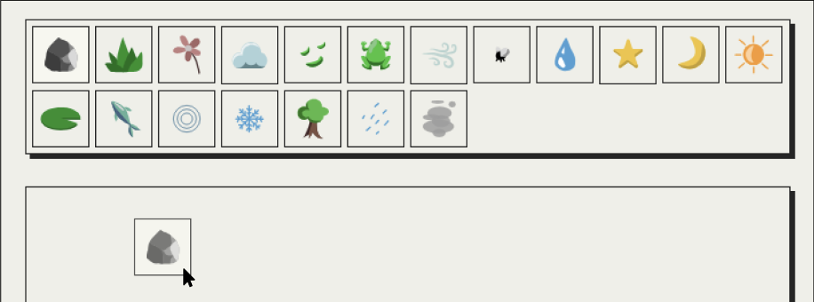
I also applied his logic and ideas to the design of the icons, keeping them simple, yet recognisable to everyone.
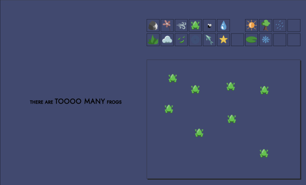
Examples below show icons that do not require any text to signify what they are or how they are animated.

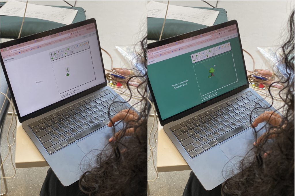
User testing revealed that this method worked well. Users intuitively used the platform as intended, creating variable outcomes. Additionally, users seemed pleased and enjoyed the experience of playing around with the canvas animations and poem generation.
I started to prototype the animation aspect of this project. I also introduced movement into my work through colour-changing backgrounds, heavily inspired by gradient.horse. User testing revealed the background on the entire website page worked better with my audience.
WEBSITE STYLISTIC CHOICES
TYPEFACE
The visual language of my website was designed to support clarity, hierarchy, and a calm sense of interaction, allowing the system of exploration to remain central. I used a geometric sans-serif typeface influenced by modernist typography (Jost), chosen for its high legibility and constructed, systematic form. This was important in a context where users are constantly interacting with moving visual elements, ensuring that textual information remains secondary but consistently readable. Additionally, CAPITAL LETTERS were used selectively to establish clear hierarchical separation, helping to flag key information such as instructions and navigational cues without introducing additional visual complexity.
COLOUR
A restrained colour system was developed using three core tones, designed to complement the more expressive animated icons within the interface. Rather than competing with these elements, the palette is deliberately soft, using off-white and off-black tones to reduce visual harshness and create a more neutral field for interaction. This supports an atmosphere of exploration, where the interface behaves more like a canvas than a fixed digital layout.
LAYOUT
Repeated container structures and subtle drop shadows were used to reinforce system cohesion and guide user attention. Containers provide separation between different types of content while also establishing clear layers within the interface, supporting readability and spatial organisation. Drop shadows function as subtle signifiers of interactivity, suggesting depth and responsiveness without relying on decorative excess. Together, these decisions create a structured but flexible environment where hierarchy is communicated through consistency, spacing, and layering.
Leave a Reply